THE EARLY MAPS
Background
|
Any expectations of reliable dates, authorship or provenance should be discarded now. Many of the maps are referred to as Portolan which means that they are supposedly created for navigational purposes - have intersecting lines radiating from the compass rose - indication of shallows - wind direction & coastal navigation marks whilst ignoring the hinterland.
Some are referred to as 'Manuscript' Maps inferring that they are a single, hand-drawn work of art - not created for reproduction by printing. The sophistication of copying techniques, as exemplified in the Vallard Map rendition of the Dauphin Map, is a distinct area of research. This is useful as dates, authorship and provenance are generally absent or unreliable whilst fashion and peculiarities can be traced - such as the style of the compass rose & the shape of islands such as the square crenelated islands of the Dieppe School from Normandy (aka the Norman School). The term Mappa Mundi simply means Map of the World and there were perhaps 100 made before the Harleian Dauphin Map but these followed the style of the Hereford map which remarkably survives along with the box in which it was created. These 'maps' are not at first easy to understand as they have Jerusalem as the centre of the world - once orientated the features & cartographic challenges become apparent. The 3D scan and accompany information provides an accessible summary of the maps creation and life. |
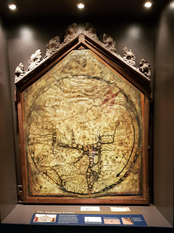
Hereford Mappa Mundi c1300
|
Inventing coastline and populating it with imaginary islands, sharp promontories and immense rivers that are all duly named and recorded - is absolutely de rigueur. The Dutch used the company directors names everywhere from Tasmania to the Gulf of Carpentaria - Flinders used letter before committing to a name. Some names persist as they are used by subsequent navigators irrespective of the validity of the original chart - as with Staaten River on Cape York.
On occasion - as in the 1644 Bonaparte Map - the uncharted coastline is dotted as in the Great Australian Bight to indicate that it had not been seen although 4,000kms of the east coast are accurately represented despite the 125 years pre-Cook.
Many of these maps only survive because they have been accumulated in an Atlas and presented to the King of France or England. As such there is a natural tendency towards a standard theme - a style guide for the atlas to showcase the author's art. Compilations made many years after the described voyages - as with the 1670 Secret VOC Atlas - often have a common set of scales, colours and formations with the details and date of the voyage and the sequence of 'discoveries' drawn from the recollections of surviving crew in the absence of original, charts, logs or personal note books. The forms a powerful impression that the reader is seeing the actual chart of the voyage - it is very difficult to mentally divorce the map notation from the image.
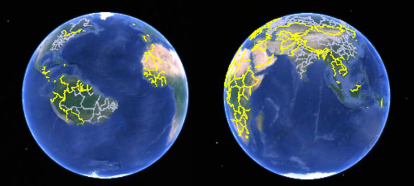
There may be subtleties of colour & form indicating what is known, unconfirmed or hypothetical which are lost to us but it is more likely that invented geography is simple self-preservation - flattery of sponsors - pandering to accepted wisdom, especially that held by the Pope. Most sailors were not cartographers - scraps of information were assembled for navigation purposes - compiled into a map by an artist with an artistic aversion to empty canvas and the unbalanced picture as demonstrated by the Google Earth below. However, the absence of truth will not stand in the way of a good picture.
On occasion - as in the 1644 Bonaparte Map - the uncharted coastline is dotted as in the Great Australian Bight to indicate that it had not been seen although 4,000kms of the east coast are accurately represented despite the 125 years pre-Cook.
Many of these maps only survive because they have been accumulated in an Atlas and presented to the King of France or England. As such there is a natural tendency towards a standard theme - a style guide for the atlas to showcase the author's art. Compilations made many years after the described voyages - as with the 1670 Secret VOC Atlas - often have a common set of scales, colours and formations with the details and date of the voyage and the sequence of 'discoveries' drawn from the recollections of surviving crew in the absence of original, charts, logs or personal note books. The forms a powerful impression that the reader is seeing the actual chart of the voyage - it is very difficult to mentally divorce the map notation from the image.
There may be subtleties of colour & form indicating what is known, unconfirmed or hypothetical which are lost to us but it is more likely that invented geography is simple self-preservation - flattery of sponsors - pandering to accepted wisdom, especially that held by the Pope. Most sailors were not cartographers - scraps of information were assembled for navigation purposes - compiled into a map by an artist with an artistic aversion to empty canvas and the unbalanced picture as demonstrated by the Google Earth below. However, the absence of truth will not stand in the way of a good picture.
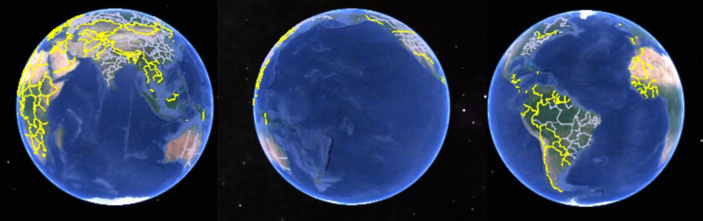
The artistic dilemma for the Mappa Mundi maker - Google Earth
Think 'Krakatoa East of Java' & Turner's 'Fighting Temeraire' towed up the Thames to the breakers yard by a steam tug, with the sun setting in the East.
South America meets Sumatra tempting for Columbus's brother - the Lisbon mapmaker Bartolomeo.
|
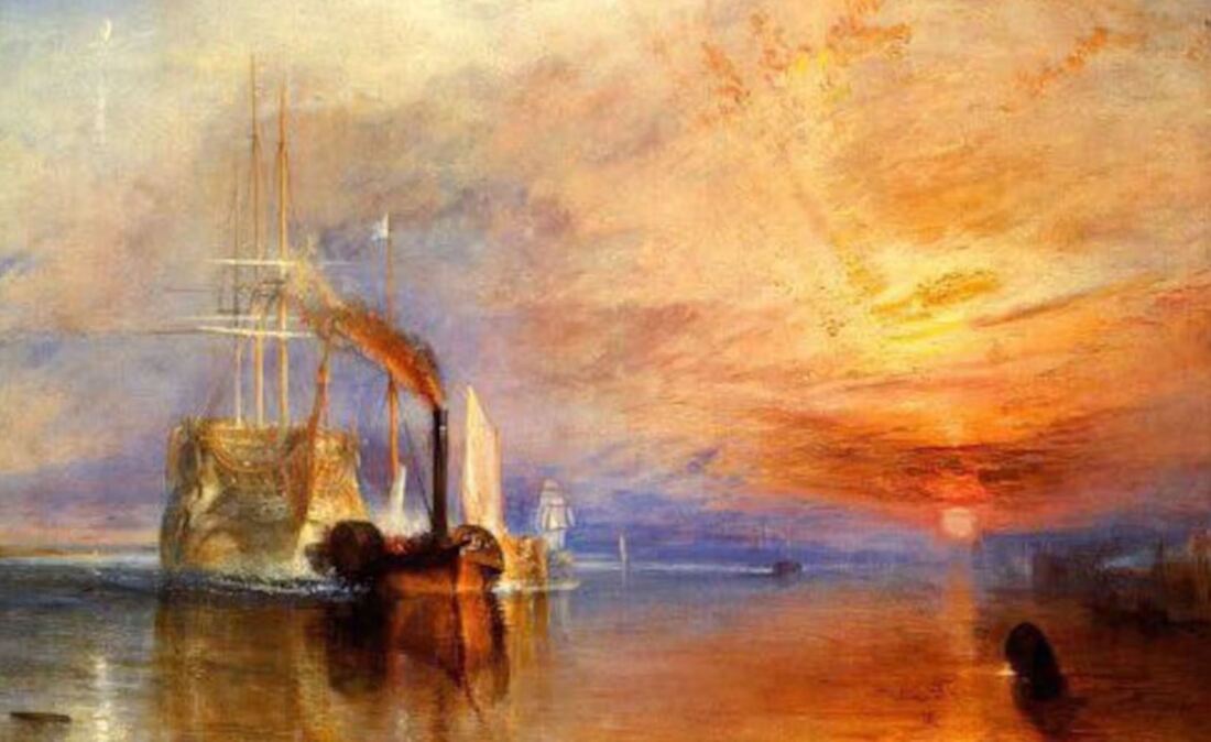
JMW Turner 'The Fighting Temeraire' 1838
|